Adding dark mode to the personal website template

by Simon MacDonald
on
 Photo by Luke Stackpoole
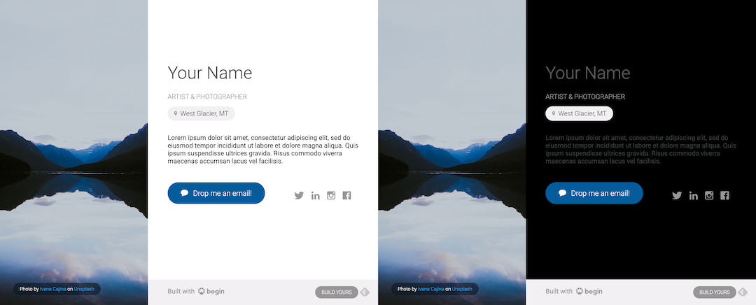
Dark Mode is a popular feature of many websites. It helps to reduce eye strain by adjusting the brightness of the screen according to current lighting conditions.
In this post, we will progressively enhance our personal website template to add dark mode functionality. If you don’t already have a website deployed via Begin follow our personal website tutorial to deploy the template in 5 minutes, then come back here and get ready to enhance.

Detecting dark mode using media query
Luckily CSS has a prefers-color-scheme media query that can detect user’s system color scheme preferences without using JavaScript. The property can have a return value of light, dark or, no preference.
Let’s add some CSS to adjust the background and text colors to match the user’s preference. Open up the src/views/styles.js file and add the following code above the body selector.
/* src/views/styles.js */
@media (prefers-color-scheme: light) {
  body {
    background-color: #FFFFFF;
  }
}

@media (prefers-color-scheme: dark) {
  body {
    background-color: #000000;
  }
}
Then run npm start from your command line and visit https://localhost:3333 in your browser. The background color will change to match the preferred color scheme. To test light and dark modes without modifying system preferences, you can use the emulate CSS media feature in popular browsers like Chrome or Firefox.

Allowing users to toggle dark mode
The above solution is satisfactory if all we want to do is swap modes based on the OS preference, but we want to allow users to select which mode the site will use. To add this interactivity, we will need to modify the CSS we just added to remove the media query and instead key off of the data-theme attribute of the HTML tag.
/* src/views/styles.js */
:root {
  background-color: #FFFFFF;
}

:root[data-theme="dark"] {
  background-color: #000000;
}
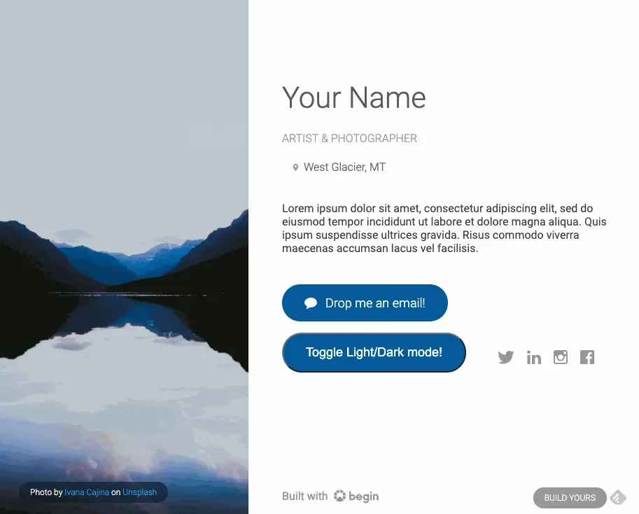
In order to add interactivity we’ll add new component called toggle-button.js in src/views to represent the toggle button.
// src/views/toggle-button.js
module.exports = function ToggleButton () {
  return `
<button
  class="
    display-inline-flex
    align-items-center
    padding-top-16
    padding-right-32
    padding-bottom-16
    padding-left-32
    margin-right-18
    margin-bottom-16
    font-size-18
    font-weight-300
    text-decoration-none
    color-FFFFFF
    border-radius-pill
    background-color-045C9C
    background-color-hover-058AEA
    transition-background-color
  "
  id="toggle-button"
>

  Toggle Light/Dark mode!
</button>
  `
}
We’ll add the toggle button to our layout by modifying the src/views/content.js file. First require the toggle button component:
// src/views/content.js
const ToggleButton = require('./toggle-button')
Then add the toggle button to the layout. For the example, I’ve added it between the MailLink and SocialMedia components around line 81 to have it front and center for this demo.
// src/views/content.js
${MailLink({
  email
})}
${ToggleButton()}
${SocialMedia({
    twitter,
    linkedin,
    instagram,
    facebook
})}
Next we’ll need to add some client side JavaScript to handle the toggling of light and dark modes. So, we’ll need to create a new file in public called index.js with the contents below.
// public/index.js
/* eslint-env browser */
(function (){
    const themeButton = document.getElementById('toggle-button')

    let currentTheme = localStorage.getItem('theme') ||
      (window.matchMedia(
        '(prefers-color-scheme: dark)').matches ? 'dark' : 'light'
      )
    document.documentElement.setAttribute('data-theme', currentTheme)

    themeButton.onclick = function toggleTheme () {
      let currentTheme =
        document.documentElement.getAttribute('data-theme')
      let targetTheme = currentTheme === 'dark' ? 'light' : 'dark'
      document.documentElement.setAttribute('data-theme', targetTheme)
      localStorage.setItem('theme', targetTheme)
    }
  }())
Let’s explain what’s going on in the code above.
- We’re using the
document.getElementByIdmethod to get a reference to the toggle button. - The
localStorage.getItemmethod is used to get the current theme from the local storage. If there is no theme in the local storage, we’ll set the current theme tolightordark, depending on the user’s preference. - Then we’ll set the
data-themeattribute of the HTML tag to the current theme using thedocument.documentElement.setAttributemethod. - Finally, we register an event handler for our toggle button which will toggle the theme when clicked and update local storage.
- All of this is wrapped in an Immediately Invoked Function Expression (IIFE) to prevent a flash of color when the page loads with the incorrect theme.
Then we need to load our new JS file when the page loads. We can do this by adding the following code to the src/views/main.js file. First, require the @architect/functions module.
// src/views/main.js
const arc = require('@architect/functions')
Second, add a script tag just above the body tag. We’ll use arc.static method to get the correct path to the public directory.
// src/views/main.js
<script src="${arc.static('index.js', {stagePath: false})}" type="module" crossorigin=""></script>
Now we can reload the page and the toggle button will be active.

Next Steps
I’m sure you noticed that we only changed the site’s background color when we toggle between light and dark mode. The next step would be to extract all of the colors used on the site into CSS variables. Then when we toggle between color modes, the entire site updates accordingly. We’ll leave that up to you to figure out, but if you want a hint, check out what we did over on the arc.codes website.
If you want to pull down a working example of the above code, you can check out the dark branch of this repository.
