On the fifth day of Enhancing: Enhance Styles

by Simon MacDonald
@macdonst
@macdonst@mastodon.online
on
 Original photo by Roxana Maria on Unsplash
Yesterday we abstracted our layout and components into a few composable custom elements where our markup currently looks like
<page-wrapper>
  <section class="m-auto p2 font-sans">
    <h1 class="mb1 font-semibold text3">About Me</h1>
    <social-links></social-links>
  </section>
</page-wrapper>
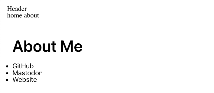
Here’s a screenshot of where we’re at

It will not win any design awards, but we can quickly improve this with utility classes and scoped stylesheets in our single-file components.
Enhance projects include a (totally optional) built-in CSS utility class system out of the box. The generated stylesheet is usually very small, and developers can even configure their app’s design scale and color palette.
In order to give us a clean slate, Enhance Styles’ CSS reset is fairly aggressive. No problem, let’s start by building up some layout and typography on the <section> and <h1> around our <social-links> element.
<section class="m-auto p2 font-sans text-center">
  <h1 class="mb1 font-serif font-semibold text3">About Me</h1>
  <social-links></social-links>
</section>
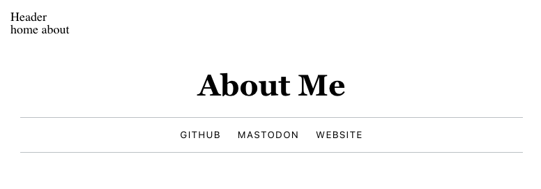
We’ve set some automatic margins, a bit of padding, and some text adjustments.
If you’d like to reference a list of utility classes as you learn the system conventions, check out the temporary .enhance/ build directory at the root of your project and open up generated.css. This file works well as self-documented reference, even when customized with a stylesheet.json configuration.
Now, let’s jump into the <social-links> styles:
export default function SocialLinks({ html, state }) {
 const { store } = state
 const { socials = [] } = store
 const liClasses = 'uppercase text-1 tracking3'

 return html`
   <style>
    ul {
      border-color: var(--secondary-200);
    }
    li a:hover {
      text-decoration: underline;
    }
  </style>

  <ul class="list-none p0 flex flex-col flex-row-lg gap0 justify-center border-solid border-t1 border-b1">
    ${socials.map(social => `<li class="${liClasses}"><a href="${social.href}">${social.label}</a></li>`).join('')}
  </ul>`
}
We’ve added a few things here:
- I’ve created a string variable to hold repeated classes for each
<li>. Remember, this is server-rendered, so the HTML will arrive at the browser with these classes in place. - A
<style>tag has been added to set a border color and a:hover underline. These selectors will automatically be scoped to this component and hoisted to the document’s head. - Several utility classes have been added to the
<ul>for a properly centered flex layout with top and bottom borders.
Ah, much better:

Shout out to Cole Peters for helping with the aesthetics here.)
Next Steps
Tomorrow, we’ll take a look at creating a dynamic <head> element for our entire site. Here we’ll be able to apply more universal styles, change our <title>, and add a rel=”me” link!