Building a Design Portfolio with Enhance

by Cole Peters
@colepeters@mastodon.online
on
There’s a lot to be said for dogfooding, and lately I’ve been eating a ton of Enhance™ brand dog chow. Whether using it to build our ludicrously fun landing page or a quick demo of our fluid modular scales, I seem to appreciate Enhance the more I use it. (You might think it’s easy to heap this kind of praise on a product I’m partly responsible for nurturing, but like many creative folks, my standards tend to skyrocket when dealing with my own output.)
Recently, our team was discussing the idea of producing more example applications — you may have noticed Ryan’s recent authentication examples or Taylor’s test app for database providers. Meanwhile, I’ve been really excited to see what the web designers of the world will get up to once they get familiar with our framework — and with that in mind, I spent a week or so putting together an example of a design portfolio built with Enhance.
My goal with this example app was to keep the code clean and easy to follow, while also demonstrating just how straightforward it can be to create appealing, engaging interfaces with a minimal, standards based stack. That stack consists solely of:
- Enhance, for authoring web pages and components
- Enhance Styles (which is built into Enhance itself), to style our pages and components with parametric CSS utility classes, fluid modular scales, custom properties, and component scoped CSS rulesets
Despite this stack being focused on Enhance, it’s important to note that most of this project’s code is just HTML and CSS. Yet, when viewing it in the browser, this app feels very much like what you might expect from a more involved tech stack — except that it loads faster, is more resilient, and works without JavaScript in the browser (teehee).
In all seriousness, though, herein lies a fundamental truth: you really don’t need much beyond web standards these days to create beautiful, dynamic, engaging web content. I want to say that extra loud for all the designers and CSS focused engineers out there who I know have felt (quite understandably) shut out of a lot of JS centered web development over the past decade. It used to be that a web designer could carry out a lot of their work using just HTML and CSS. I feel like those days are coming back with a vengeance, especially with tools like Enhance helping folks take advantage of things like custom elements and cutting edge CSS techniques (along with a ton of under the hood optimizations to deployment and performance). The fact that the native web platform is just that good is also a win for folks more steeped in JS based web development, as it allows them to drop many additional frameworks that are no longer required for success.
In order to focus on these benefits and avoid introducing potentially unnecessary complexity, I introduced a few constraints to this example — primarily in the form of keeping all the content local to the project (instead of using a CMS, for example). I cut a few corners as well, such as omitting descriptive text for images (which I highly recommend you do in all real world projects) and using some duplicate images and placeholder text to pad out the example’s content.
With all that said, let’s take a walk through the example app and see what’s cooking.
You can view the portfolio example live at: https://snow-wfi.begin.app/
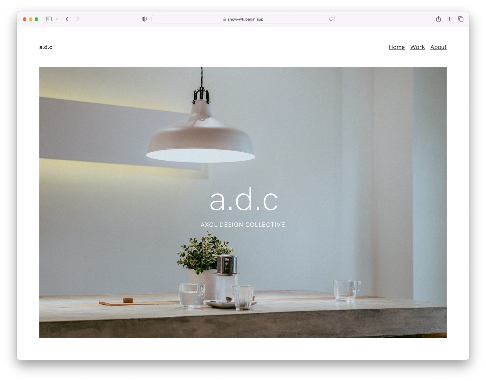
Welcome to the Axol Design Collective
The fictional Axol Design Collective — stylized as a.d.c — is an interdisciplinary design studio, which basically means they somehow manage to do architectural design, landscape design, typography, product design, and more. In reality, I just wanted an excuse to use a variety of rad design outputs as demo material for this website.
We’re introduced to a.d.c’s work on the homepage of this website, primarily through a series of impressive, high resolution photographs of ‘their’ work (in actuality, a bunch of images sourced from Unsplash). This introduces one of the first components I’ll provide an overview of — the Cover Image component.
The Cover Image component takes a series of images, renders them within a responsive container with a fixed aspect ratio, and then crossfades between each of those images on a loop — with each image sized to fill the container’s aspect ratio using the object-fit: cover CSS rule.
If you take a look at the code for this component, you’ll see there’s actually not much to it. It’s essentially comprised of a hardcoded list of image URLs, and a Single File Component which:
- Takes our list of images and turns them into
imgtags with some utility classes for styling - Renders some (component scoped!) CSS rulesets to set the component’s aspect ratio, the images’ transition styles, etc.
- Returns some HTML (on the server) to structure this component (including references to several Enhance Styles utility classes for the layout)
- Includes a script to run in the browser to toggle each image’s
opacityat a set interval, thus giving us our animation
With just these 64 lines of code, we get an engaging, customizable component to show off some beautiful photography on our homepage (or anywhere else we might want to use it).
Another win for this component: if the end user’s browser can’t load that included chunk of JavaScript (for any of a myriad of reasons that can and do happen), this component won’t break. Instead, that user will simply see the first image in the list, without the transition to other images. This is much better than the spinner (or worse, nothing at all) that you tend to get when many ‘modern’ JavaScript frameworks fail in the browser. This represents an approach called progressive enhancement — which Enhance is designed to optimize for — and which delivers a better baseline experience for all users (which can then be incrementally improved upon). We’ll see another example of this approach later in the walkthrough.
The Work page
Moving on to the Work page, we tackle a common UI design pattern — a grid of cards, in this case containing summaries of a.d.c’s case studies. This layout is composed primarily from two custom elements.
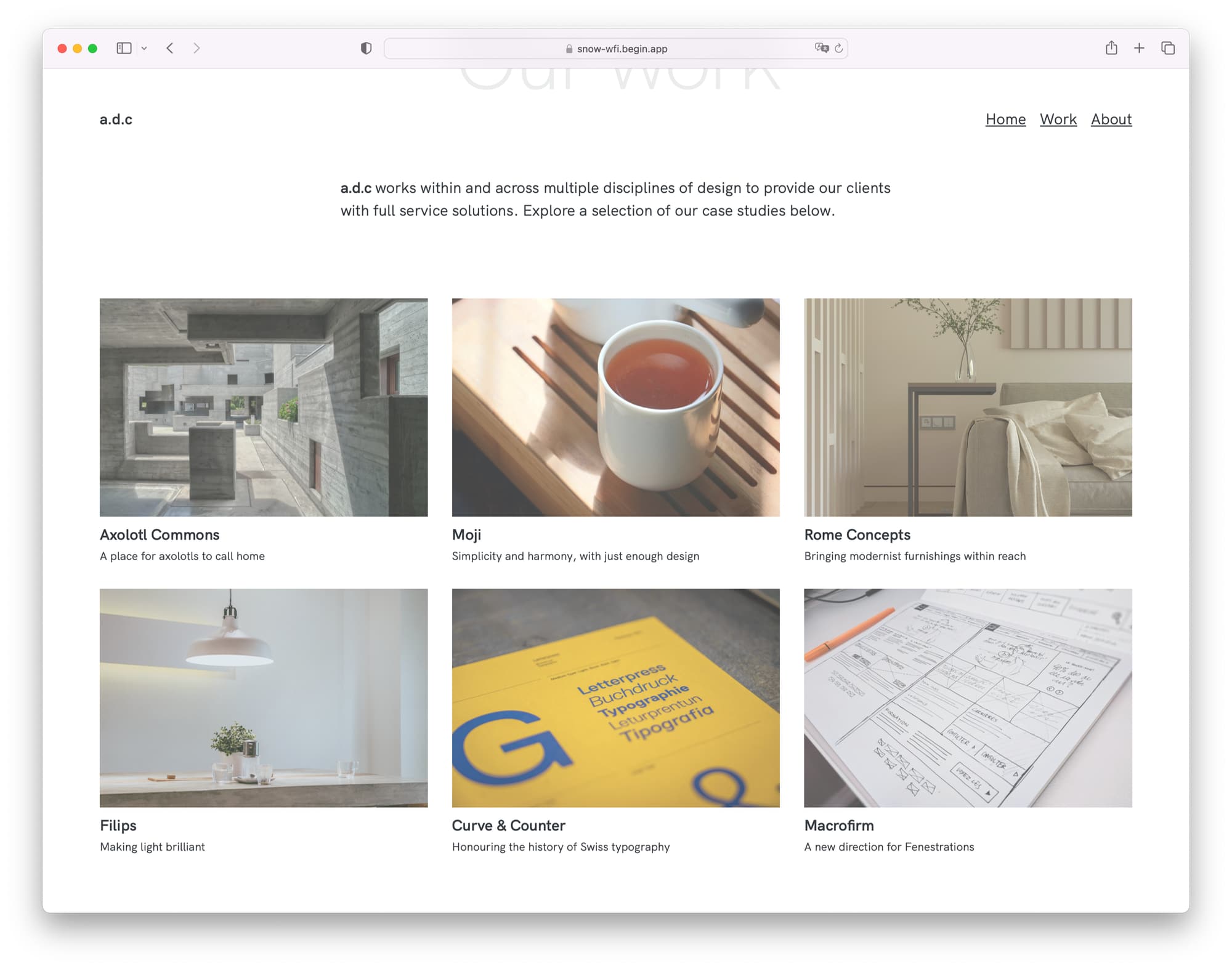
First, there’s the Case Studies component, which is a styled wrapper that applies a grid layout, with the number of columns in that layout determined by the space available to the Case Studies component itself (as opposed to the available size of the viewport). Because we’re using CSS container queries to set the number of columns, this component and its layout could be reused in a number of macro layouts, and it would still render an appropriate number of columns regardless of how much space has been made available for that component.
Second, there’s the Case Summary component, which handles rendering an individual entry in the Case Studies layout. To use the Case Summary component, we pass it a number of attributes:
- an image URL and an accompanying value for the alt attribute
- a title and description to display for the entry
- a URL to link to when the component is clicked
With these attributes passed in, the component proceeds to render a couple of CSS rulesets for the image styling (all values of which are customizable via CSS custom properties) as well as the markup for its content. By default, this component renders the image in a 3:2 aspect ratio, at 75% opacity, and applies a transition to the scale and opacity values when the component is hovered or focused. This results in a gentle but pleasing interaction that adds depth to an otherwise static grouping of cards — all with no JS required.
Let’s dig into one of these case studies to see what’s under the hood.
Going atomic with custom elements
The first few sections of each case study page are laid out the same — a large title, a full width image, and an adaptive two column grid containing some background information about the project. This brings us to a few simpler components that are nonetheless worth a closer look.
First up: the Adaptive 2 Column Grid component. This basic component renders a single column view below a certain viewport width, and then switches to a 2 column grid above that viewport width. That width value is customizable by the user of this component, but defaults to 48em. Additionally, this component will swap the order of its two columns above the given viewport width — this was done in order to show each project’s metadata list first on mobile screens, and second on larger screens in order to provide an ideal layout for either variant.
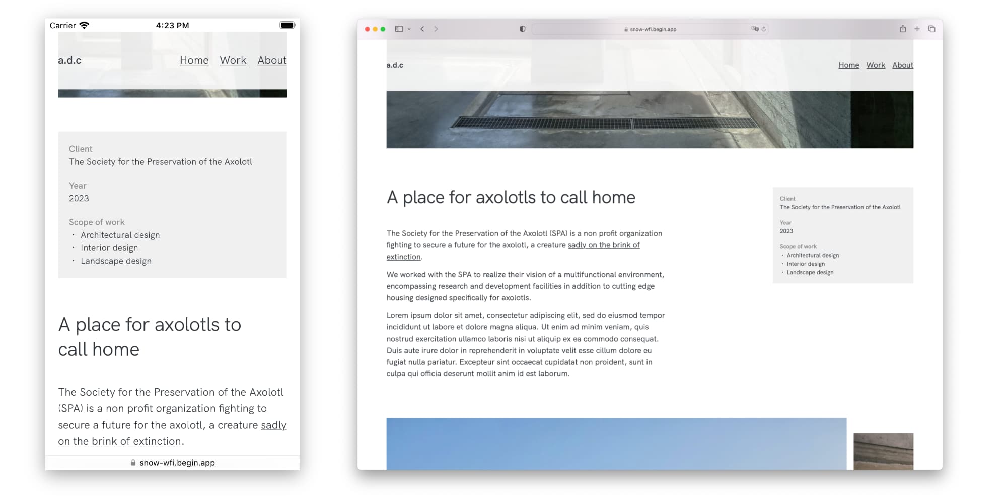
Going even simpler, there’s the Text Container component. The only thing this component is responsible for is setting a maximum width for its contents, and applying a margin between successive paragraph elements. This gives us a nice readable line length on every child element of this component, without restricting various elements (like <p> elements) to this constraint via global element selectors.
We repeat this pattern again with the Data List and Unordered List components. These components are responsible solely for providing focused, repeatable styles to lists authored with <dl> and <ul> elements respectively.
Components like this may not look like much, but they excel at creating abstractions of layout and component styles that you can easily reuse across single or multiple projects. Just as utility classes inform a methodology for composing atomic styles in place with our content, these custom elements allow us to create highly focused ‘atomic’ components, which can themselves then be composed together. When using Enhance Single File Components to accomplish this, we gain a number of benefits:
- Colocation: styles are written alongside and travel with the component itself.
- Ease of updates: component styles (whether scoped rulesets or compositions of utility classes) can be changed once to update everywhere.
- Appropriate abstraction: we avoid having to repeat utility class compositions in multiple places, and — conversely — the need to resort to global selectors which might require cumbersome opt outs.
- Brevity: both the functionality and the required styles of the component remain compact and easy to reason about.
- Containment: styles apply only to the given component and its child content.
- Performance and resilience: unlike many other web component frameworks, Enhance Single File Components are rendered on the server, meaning there’s no waiting (or chances for errors) for these components to load via JavaScript.
To me, this strategy represents a beautiful evolution of the paradigm proposed by atomic CSS; you might even call components such as these ‘atomic elements’ or ‘utility elements’.
To get a sense of how this all plays out, let’s take a closer look at a case study page — for example, the page for Axolotl Commons. On lines 7–23 of this page’s code, you’ll see a few components in use: first, the aforementioned Adaptive 2 Column Grid, and inside it, a Project Data component. The Project Data component is itself another small abstraction: it applies a background color, and then wraps its children with the aforementioned Data List component. If you look back at lines 9–22 of our HTML page, you’ll see that we’re thus using the Project Data component to render an instance of the Data List component, and a nested Unordered List component inside of it.
This should give you a good idea of how seemingly simple custom elements can be composed together to form more sophisticated layouts, all with a rigorous approach to styling and paired with highly legible, declarative source code.
A very snappy image gallery
Moving further down the page for Axolotl Commons, we get to the juicy part of the case study, presented as a horizontally scrolling image gallery. This particular gallery has a few tricks up its sleeve, however — including the use of CSS Snap Points.
To create this image gallery, I dusted off a Collection Layout component I’d first stubbed out a number of months ago for this very purpose. This is another component that delivers a lot more than the brevity of its code might suggest, purely by relying on advances in the web platform itself. Specifically, it renders an overflowing flexbox layout of items with optional scroll snap properties. This allows us to render a gallery of items which, when scrolled, will stop at the closest ‘snapped’ element inside it. This UI pattern will be familiar to anyone who’s navigated through a streaming media service’s catalog.
To complete this component (have a look at the source code if you’d like to follow along), we apply some styles to ensure the images in the gallery will be rendered at an ideal size. In particular:
- We cap each image’s inline size (the logical term for width) to 90% of the image gallery itself. This ensures a hint of the next image in the gallery is always visible as an affordance for users to scroll.
- We also cap the images’ block size (the logical term for height) at 80% of the current viewport’s height. This ensures the image remains within the vertical bounds of the browser, and also helps to create space to keep the site’s navigation bar from colliding with the image.
- Finally, we use the
object-fit: containproperty to ensure that each image’s intrinsic aspect ratio is preserved, thus avoiding images getting stretched when satisfying the previous two size restrictions.
This gives us a fully responsive horizontal image gallery with scroll snapping, which works with absolutely no JavaScript required.
We aren’t quite done yet, though — we still have another type of image gallery to explore.
A little light boxing
The second type of image gallery included in our portfolio example renders a grid of thumbnails, each of which can be clicked to display the full size image in a lightbox (that is, the image rendered in a modal overlay). This type of gallery can be seen on the case studies for Moji, Rome Concepts, and Curve & Counter.
To create this gallery, we start with the Image Grid component, another example of concise source code belying a depth of functionality. First, we use a couple utility classes to render a grid layout with fluid gaps. The real magic happens when we set our grid-template-columns property on the grid layout. It might be worth pulling this style apart in more detail to make things clear:
- First, we use the
repeat()function with theauto-fitvalue to create a layout composed of as many columns as will fit without overflowing our grid container. - Next, we use the
minmax()function to specify the minimum and maximum permitted width of each column; this will be used to determine how many columns can fit in each row. - We define our minimum as either 20% of the component’s width, or 250px — whichever is larger — using the
max()function. We do this in order to prefer a fluid value (20%), but not if that value ends up being smaller than 250px (which would make the images in the grid quite small). - Finally, we define our maximum value as
1fr, which equates to 100% of the available width (not the full width) of the component. This keeps the image grid usable if only a very small number of images are used, in which case each image would occupy an equal portion of the available space.
The result is a fully responsive grid of fluidly sized, reflowing images, created without a single media or container query.
Next, we have our Lightbox component. We use the dialog element to power much of this component, as it includes a ton of helpful accessibility measures such as focus trapping and built in screen reader support. Unfortunately, the dialog element requires client side JavaScript to operate, so we need to account for the instances where JavaScript may fail to load via another dose of progressive enhancement.
To do this, we first wrap our Lightbox content with a link to the full size image — this way, if JavaScript isn’t available, users clicking on the thumbnail will still be forwarded to the full size image. Then, we include a script on the client which, when loaded, takes over the click event for those links, and instead triggers the link’s corresponding dialog element to open, revealing the full size image as modal content instead. We also include a form with a button to close the dialog element once it’s been opened.
Finally, we use our Image Grid and Lightbox components together for the full effect — a responsive grid of image thumbnails that open full sized images in lightboxes (or as full page redirects if no JavaScript is available). Pretty neat, and built entirely with standard platform features!
Over to you!
This example app was a ton of fun to build, but it wasn’t just a self serving exercise. As mentioned earlier, I’m really excited to find out what other design minded folks are going to get up to with Enhance — and to encourage that, I invite all of you to use this project’s code however you’d like. The linked GitHub repo includes a readme with instructions on how to get started with running this app locally, as well as links to the Enhance docs so you can start exploring our framework in more detail. If you happen to make use of any code in this project, attribution is always appreciated, but is absolutely not required.
However, I do hope you’ll share whatever you make with me and the rest of the crew over on our Discord (or hit us up with any questions or input you may have)!
It’s such an exciting time to be working on the web, and the increasing pace and breadth of web standards is only making this all the more exciting. Combined with a little help from frameworks like Enhance to get potentially tricky aspects like server side rendering in place (and to provide a happy path to integrating databases and APIs), I think it’s safe to say the future is looking incredibly bright. I hope to see you there!